I was looking through my folders of digital scrapbooking products and decided that they were some things I really wanted to use today. Red has to be my least favorite color but this page needed it… more of it. The first time I scrapped these photos I was not sure what to do with the photos as far as processing and I could not decide which ones to use. So, I just made them black and white and slapped them onto the page. Little did I know, I would want to change this at some point down the line. I will say that I am glad that I kept the RAW/DNG files of my photos. I was able to do another edit and keep all of the color and have not look to wonky. I was not very good at setting white balance last year…lol! Live and we learn, right?
This is my original page.
I still like this page but like I said, I wanted to fix those photos. I makeover pages for different reasons. Since I am printing these and adding to an album, I want to feel like I love every page that I send to be printed. Even my ideal font choices have changed since last year. Now I am realizing that since Aida is starting to read on her own, it would be a good idea to have some nice clear fonts that will be easy for her to read (without having to guess what a letter is). Plus, I might want to be able to read these years down the line. I print all of my pages in size 12 x 12 now and as long as the font size is anywhere between 10-12, then I will be able to read the story without any problems.
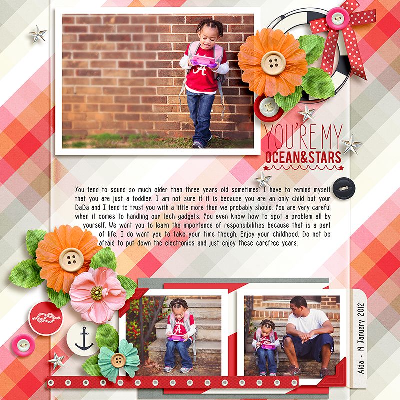
Here is my updated version of the page:
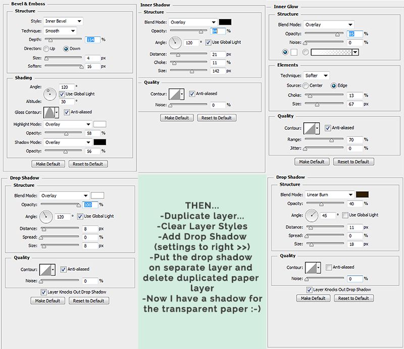
I love the original but I definitely love this updated version so much more. I really wanted to see what the orange, red and pink would be like together. Then I started searching for some word art, and I came across this kit with anchors with a color palette of pink, navy and red. Mixing and matching was quite fun and I experimented with my background a bit. I have a serious pet peeve of putting text on a patterned background. My eyes cannot read it. I almost get a headache, but I thought what if the background pattern was a bit hazy and muted where the text is place. To get the transparent background overlay, I did the following with a solid white paper :
**Edited to add the following:
With the shadow layer separated, I select that layer in PS and make sure the transform box is around it. At the top of my screen, the x and y coordinates and height and width are visible. I increase the width by 0.45 or 0.50%.
![]()
Then, I apply Filter > Blur >Gaussian Blur > Radius: 4.0 pixels. I nudge it once or twice to the right, so that it appears evenly on both sides. My drop shadow layer is set to Linear Burn > Opacity: 100% > Fill: 30%. I use hex #2C1901, or some shade of brown for my shadow color.
I hope that is not too confusing. I am pretty sure there is probably an easier way, this is just the way that I did it and I thought I’d share. [icon name=”icon-smile”] I came back to add a few more steps. These are things I do normally with my shadows, so it did not occur to me to post the first time. I tried to do this while making the page but maybe next time I will attempt a recording. It may just be easier to see it done rather than me trying to type it out.
And to end this now super long post… Today, I am thankful for color. Yes, color. I love color and all kinds of it. I have never discriminated when I opened up my crayon box. I can remember thinking as a child that if God made the colors, then I had to like them all because everything he made was beautiful. At 29 years of age.. I actually still feel that way.
Thanks for visiting and I hope you have a good night or morning!


Hey Tronesia,
Once again I love that you offer us! I tried to do your tutorial but my result was not at all successful. So I did otherwise. But I love what you’ve done and, again, this has inspired me! thank you! !
Hi Chloe! I am editing the post to add a few extra steps. I had to play around with the opacity of my paper and shadow layers to get the result, but I will add that info soon. :)
I try again tonight and i show you the result !
I am looking forward to it!